The Idea:
Vintage Variety is a shirt design based off of a personal brand I’m developing. I’ve often wondered what a vintage soda company brand would look like if it had been influenced by video games of the day. To get a feel for the advertising aspect, I researched some vintage soda bottles. None of them quite had the feel I was looking for, which surprised me. If I wasn’t looking for it to look authentic, what was I looking for?
The answer came to me when I switched my research to early game advertisements. When video games were first coming out, everything was new and exciting. Nintendo’s catch phrase was a corny, “Now you’re playing with power.” It made me laugh and smile. That’s what I wanted to capture.
The Process:
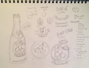
I love starting with an actual sketchbook. Photoshop is a wonderful tool, but I haven’t quite made my sketching transition there yet. Maybe when I finally get a drawing tablet.
 The first step was deciding on a name for my product. After some playing around with different name ideas, the name “8-Bit Cola” was settled on.
From there a flavor needed to be chosen. This wasn’t as hard to settle on as I first thought. The most iconic 8-bit video game “fruit” or berry in this case had to be the double cherry from Pacman. We still see it referenced in games today. Cherry Cola it was!
The research of previous vintage bottles came into use here. The layout on the bottle needed to look and feel authentic. At least as something that could be printed and sold. With the logo and layout decided on, it was time to take it into Illustrator. (Note: the picture was taken with my phone. I should really think about investing into a scanner). 😛
Illustrator:
From there it was pretty much just the long process of vectoring the image. It definitely get’s easier the more you do it. I grabbed my CMYK color pallet from color.adobe.com and my font “Lobster” from fontsquirrel.com (if you need a font, this is an amazing resource).
T-Shirt….?:
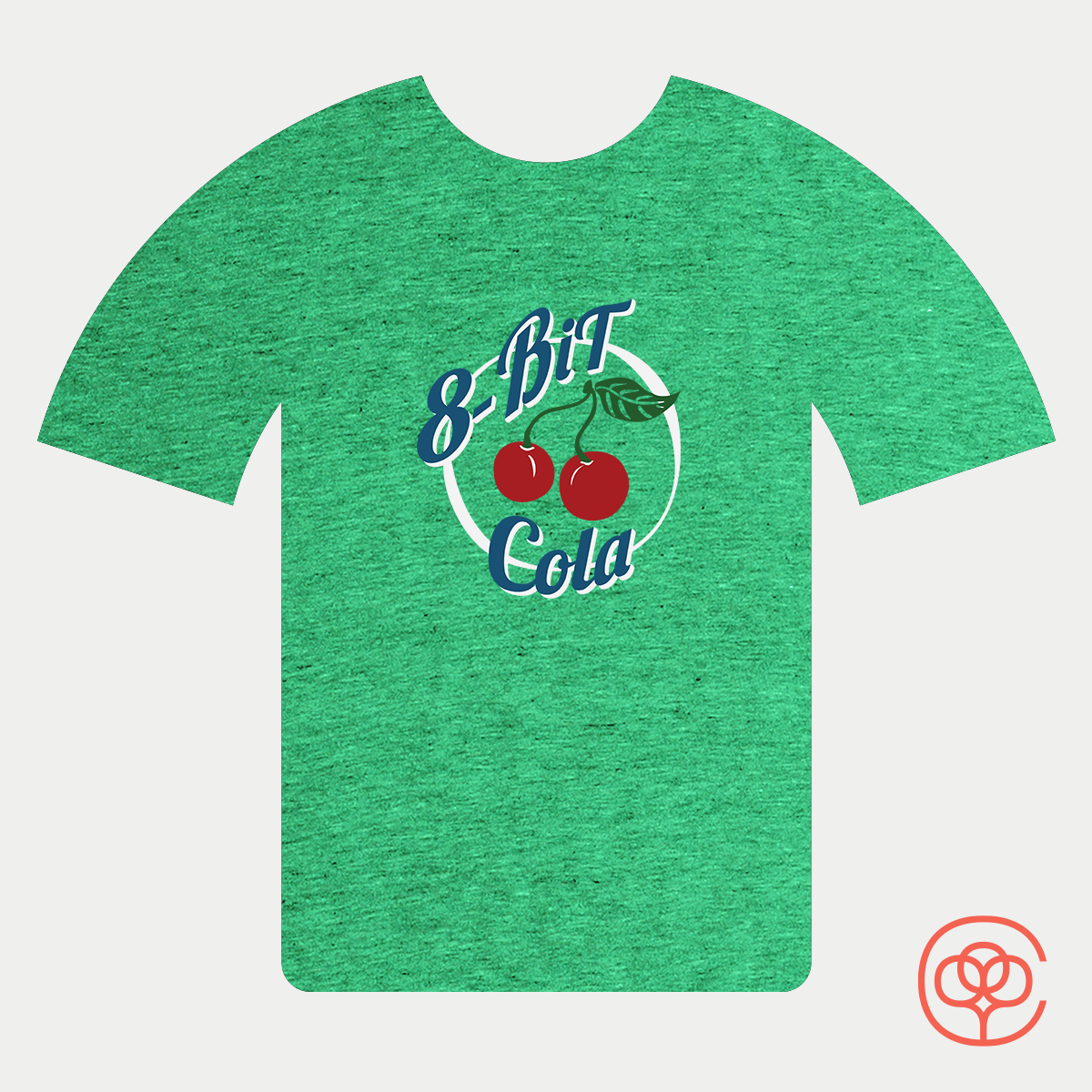
Towards the end of my logo design phase, I thought it would make a really cool t-shirt. I like looking at things for what they could be, and for some reason I thought this could make a really cool shirt logo (that and I just wanted another green shirt). So I detracted some of the colors to a simplified four color version of the shirt. My first submission of the finalized shirt went out to Cotton Bureau. However, it was kindly rejected, so I did not get my green shirt. But, I’m not one to give up! I still need a green shirt. So I repackaged it for Woot, and sent it in for submission. At the time of writing this, I still have not heard back, but I’m keeping my fingers crossed just in case (incredibly hard to type that way).
Conclusion/ Future plans:
Hope you enjoyed the process of my design! There will be more coming from this logo, the shirt was kind of me just getting sidetracked. I plan on making this an entire design mock up for the printing on bottles and then also design the cardboard case holder things. All of this will be coming soon!
